Team
2 designers, 1 PM, 2 devs
Timeline
1 month
Summary
Fastly’s customers integrate with the CDN via services, and two key metrics for measuring adoption are service creation and activation. The old service creation process was complex, leading to low activation rates. We simplified this process, resulting in over 5,000 new services being activated every month—a 78% increase over the previous model.
Challenge: Overwhelming Options Led to Low Service Activations
Fastly’s service configuration offered hundreds of options, leaving new users overwhelmed and unsure of how to proceed. Upon service creation, users were dropped directly onto the configuration page with minimal guidance, leading to a service activation rate of only 39%. Since Fastly generates revenue only when services are activated, improving the activation rate became a top priority.
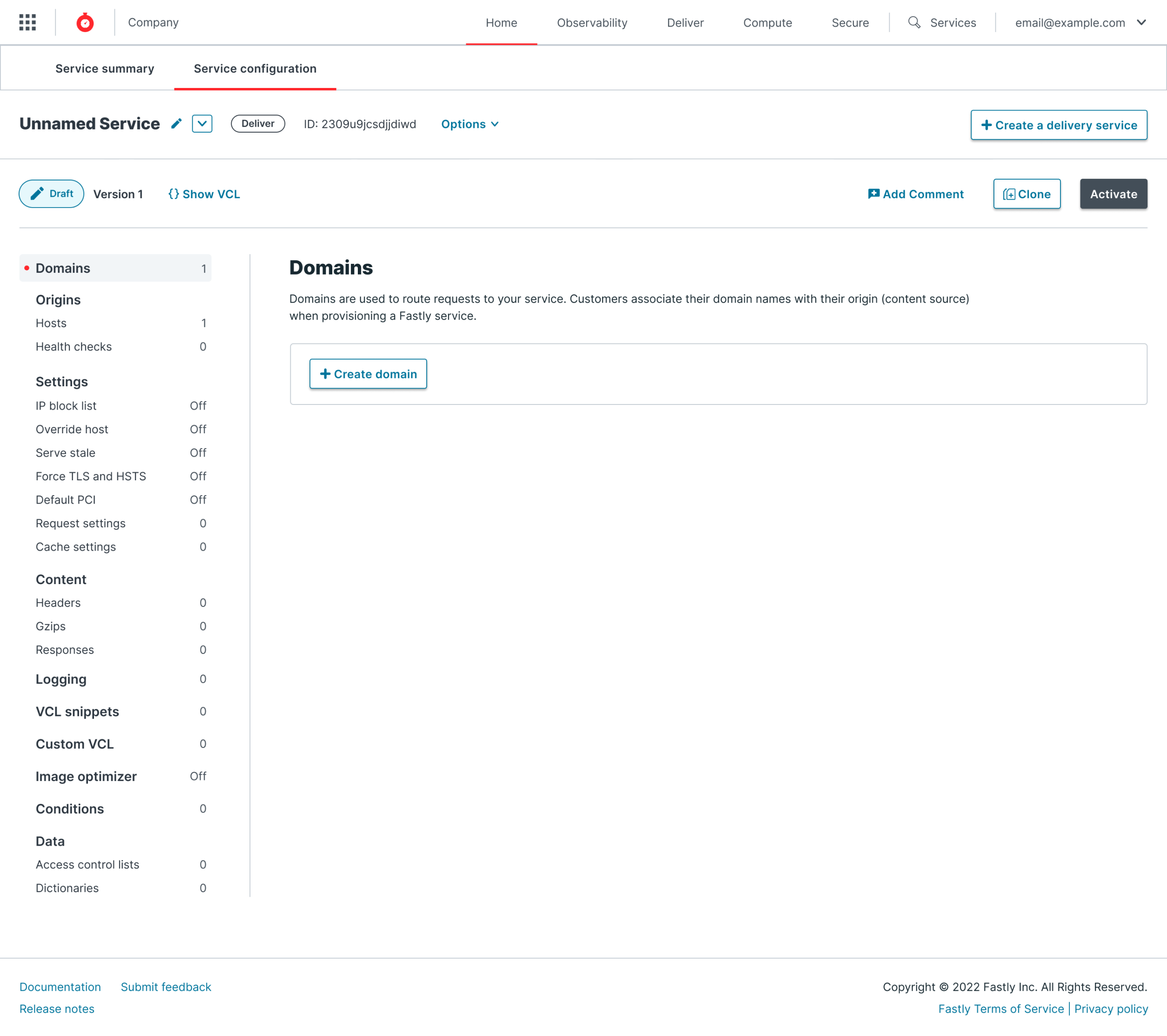 Old service creation page
Identifying the Pain Points
We discovered several "voice of the customer" tickets in our backlog, all reporting difficulties with service configuration. The most frequent complaints revolved around the complexity of the service creation process.
To gain deeper insights, we conducted interviews with the customers who submitted these tickets. Understanding their frustrations helped ensure we were targeting the real problems before starting the design process.
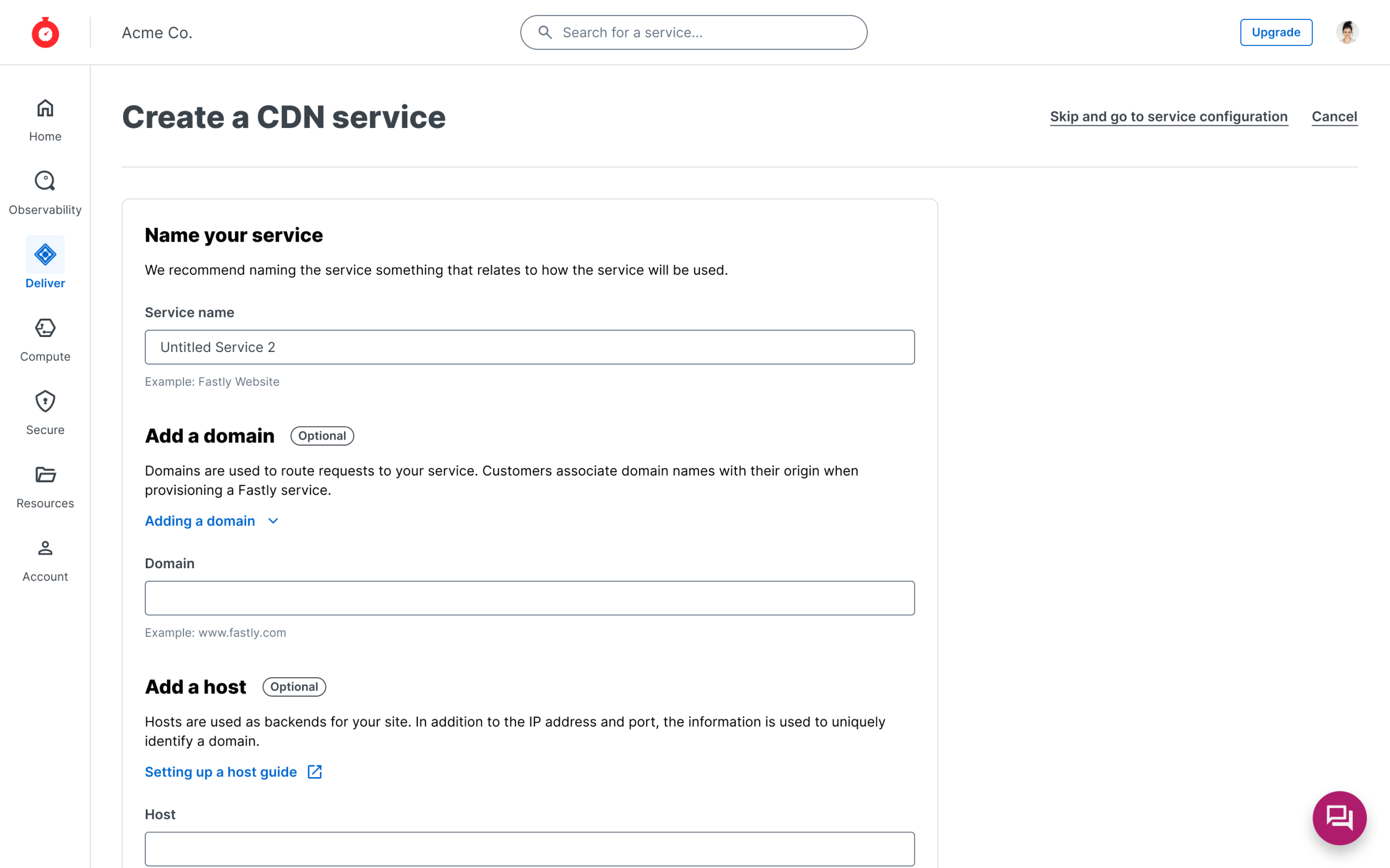 New service creation page
Collaborative Problem-Solving
To align the team, I facilitated a workshop using the Big Idea Vignettes framework from IBM. This involved stakeholders from engineering, product management, and senior leadership. The workshop encouraged collaboration on ideation and allowed us to sketch potential solutions together.
By the end, we had clear agreement on how to move forward with a simpler, user-centered service creation process.
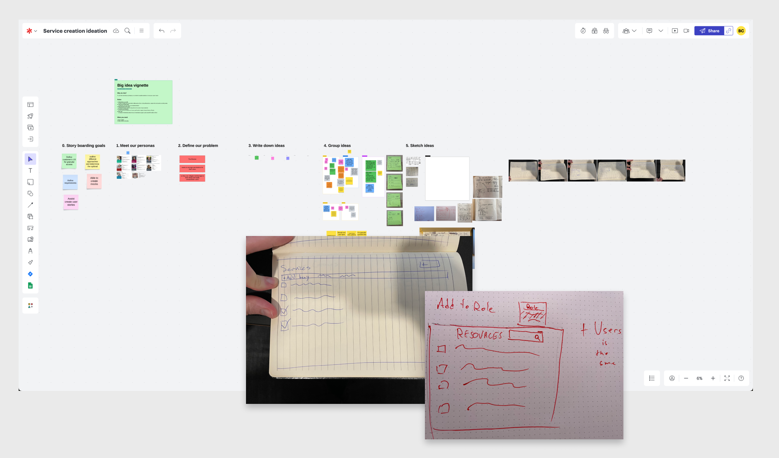 Big Idea Vignettes workshop board and sketches
Design Solution: Focus on What Matters
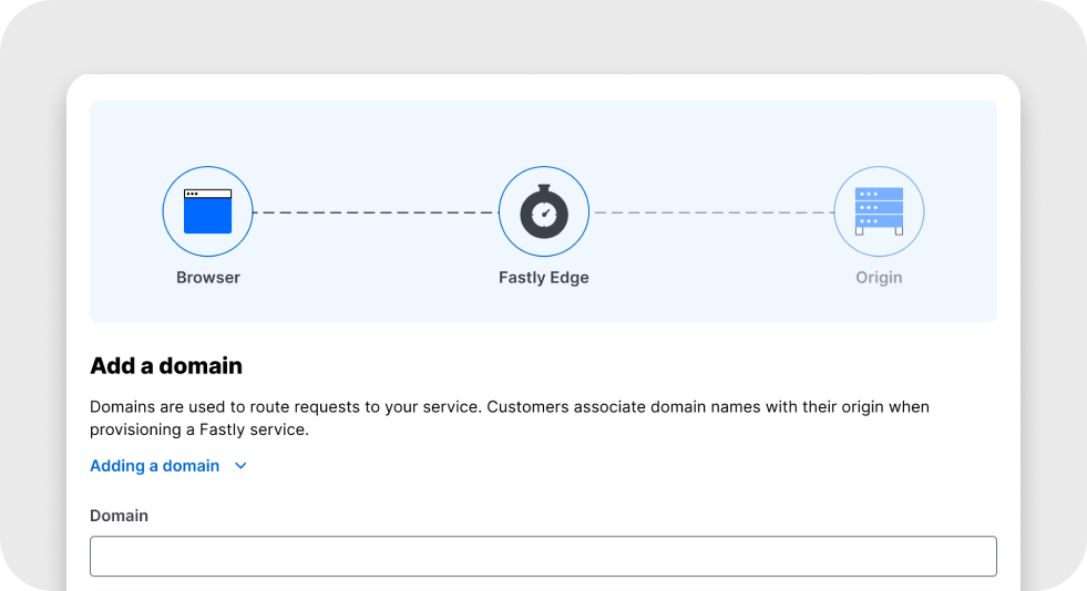
We streamlined the service creation page to expose only crucial settings for a new service, allowing users to focus on what’s necessary to get the service running. We also added sensible default settings that optimized the service configuration for common use cases.
Once the user input their required settings, they could immediately activate the service—removing unnecessary steps that previously delayed this process.
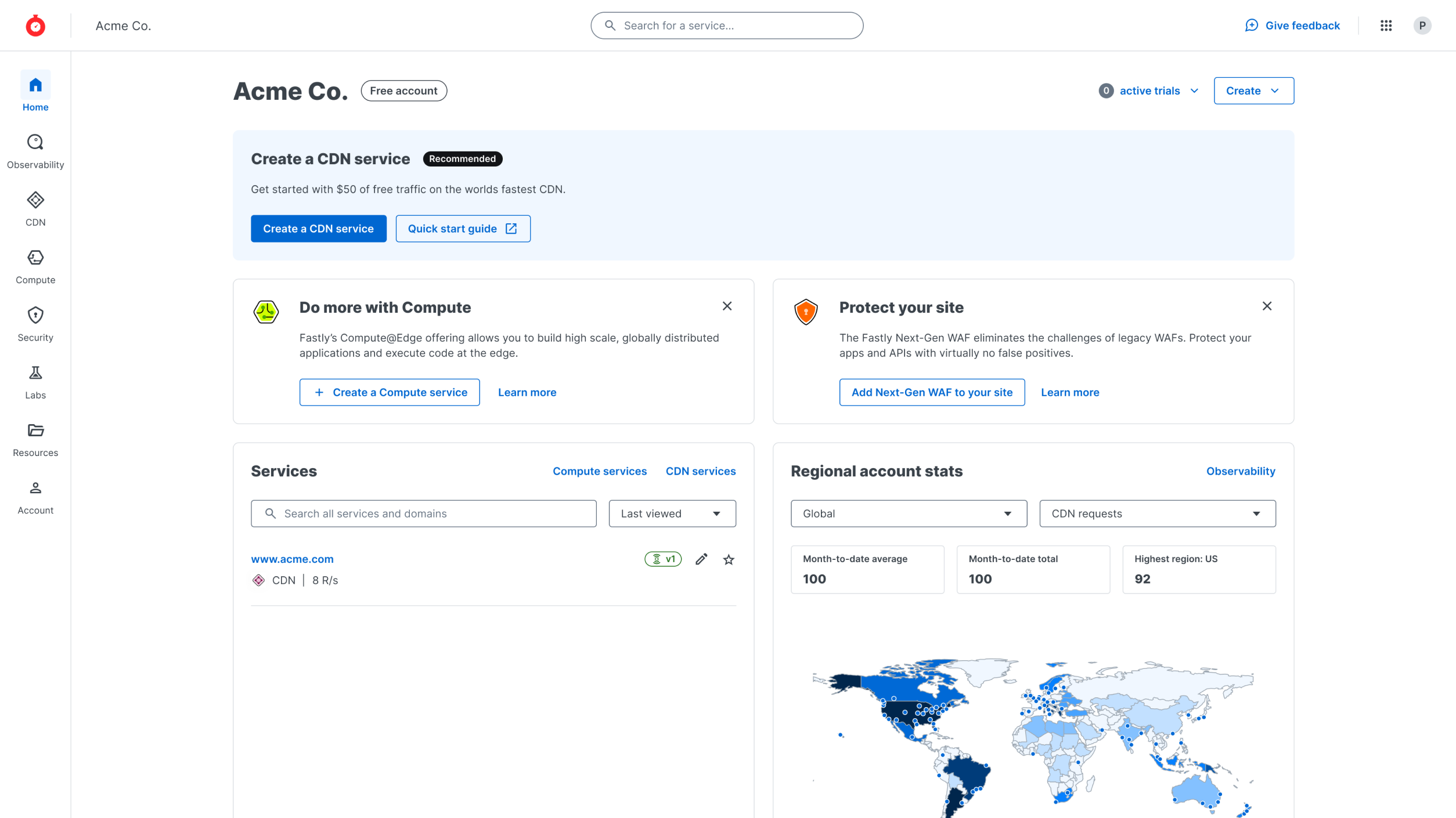 New home page with service creation CTA
Testing Assumptions with Prototypes
After designing an initial prototype based on our workshop ideas, I conducted 1-on-1 interviews with both customers and Fastly employees.
Feedback revealed that while the layout and workflow were solid, the language we used was confusing and filled with industry-specific jargon. I partnered with our content team to simplify the language, making the interface more approachable for new users.
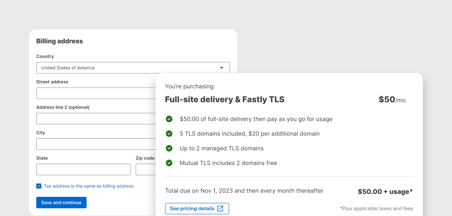
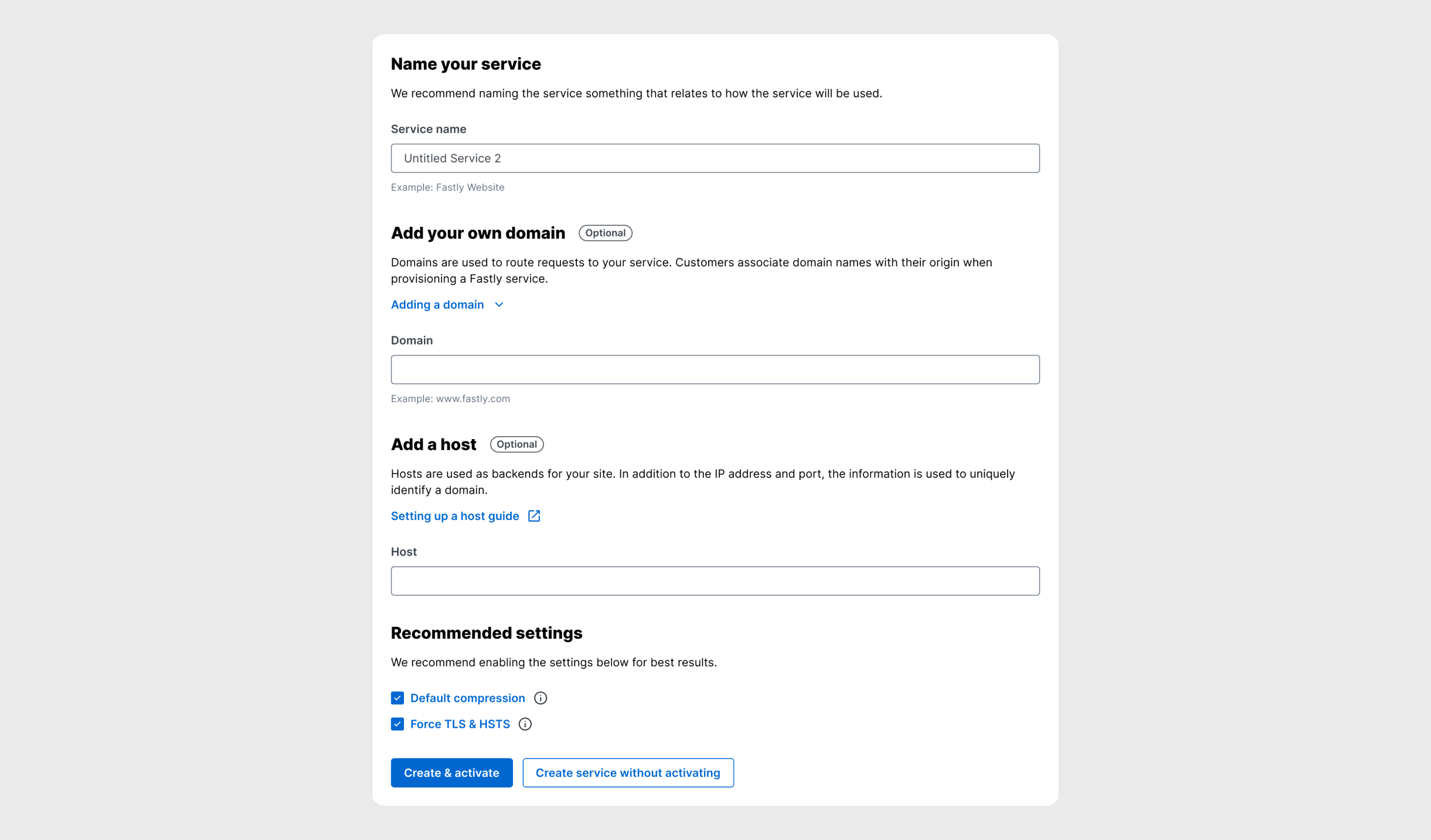 New service creation form with recommended settings
Results
- 78% increase in service activation rate YoY
- Used by over 15,000 users each month
- Over 4,500 new services created monthly through the new page
- The page is now mobile-friendly, allowing users to complete the process on any device—previously, it was only accessible on desktop.
This project not only improved service activation rates but also made onboarding more intuitive, driving user adoption and increasing business growth.
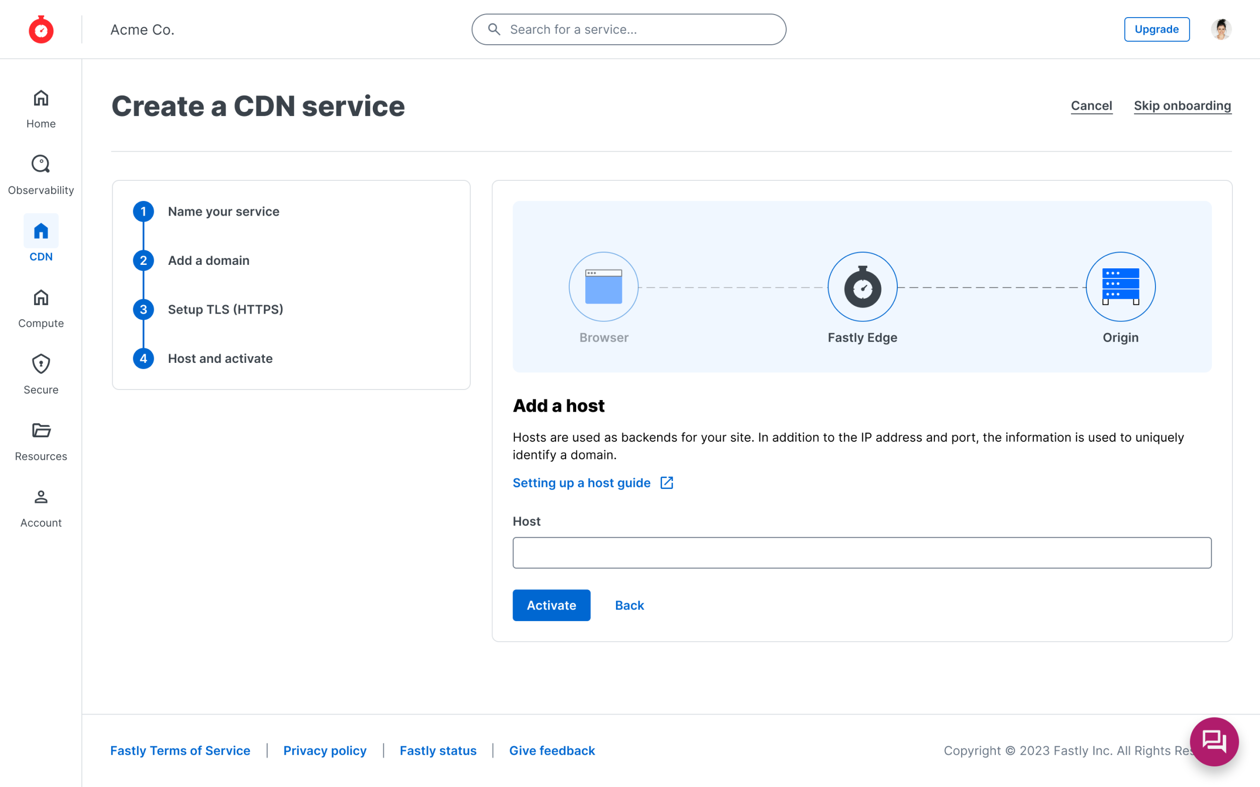 Upcoming design that tests out a "wizard" type workflow

