Revamping Fastly's Upgrade Experience: 300+ New Customers Each Month
Team
1 designer (myself), 3 developers, 1 PM
Timeline
2 months
Summary
Fastly’s upgrade experience was cumbersome, error-prone, and out of legal compliance, leaving hundreds of users stuck with payment information on file but not getting billed. My team and I redesigned and rebuilt the entire upgrade flow, simplifying it into a seamless, user-friendly process. As a result, Fastly gained over 300 new customers monthly, improved its conversion rate by 22%, and eliminated a major legal risk.
Background
Fastly’s upgrade process was a critical point for both user conversion and compliance. When I joined the team as a product designer, I was assigned to work on improving billing and growth-related workflows. Upon reviewing the upgrade experience, I immediately identified multiple friction points that were causing significant drop-offs and compliance risks.
The problem
The process required users to navigate between two separate pages: one for entering their tax address and another for payment information. Even worse, users could enter their payment details but fail to complete the upgrade because they didn’t accept the terms and conditions on the final screen. As a result, hundreds of users were in a “stuck” state—not upgraded but still thinking they had completed the process.
This convoluted experience not only led to user frustration but also failed to meet legal requirements, putting Fastly at risk.
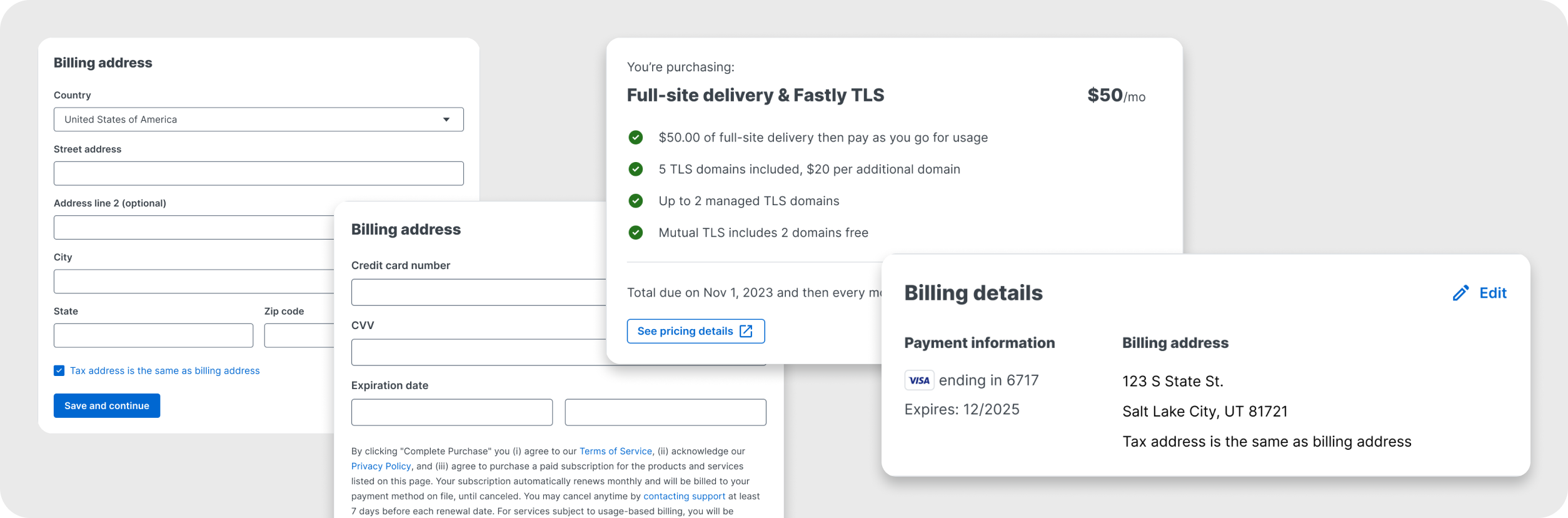
 Old checkout page
Investigating the Issues
I wanted to validate the extent of these problems, so I started by analyzing key metrics through Pendo. I focused on bounce rates, task completion rates, and time spent on each page. To get a complete picture, I also asked our back-end developers to pull data from the billing system, looking at how many users had entered their payment info but weren’t being billed.
Here’s what we uncovered:
- 40% of users who entered their tax address never completed the payment step.
- Hundreds of users had entered payment details but were stuck in an incomplete upgrade state.
- Legal flagged the process as non-compliant, as it didn’t adequately disclose terms and conditions.
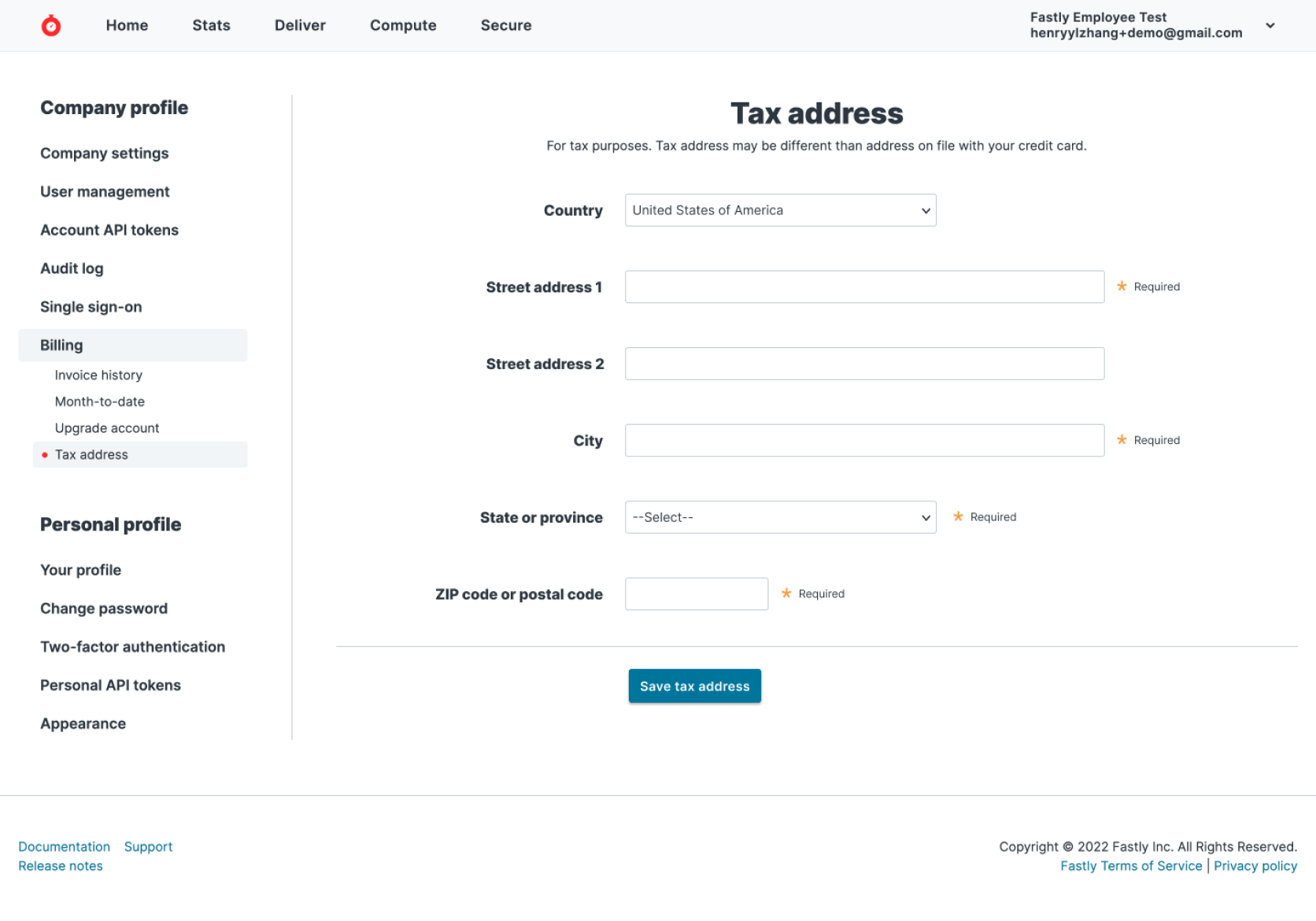
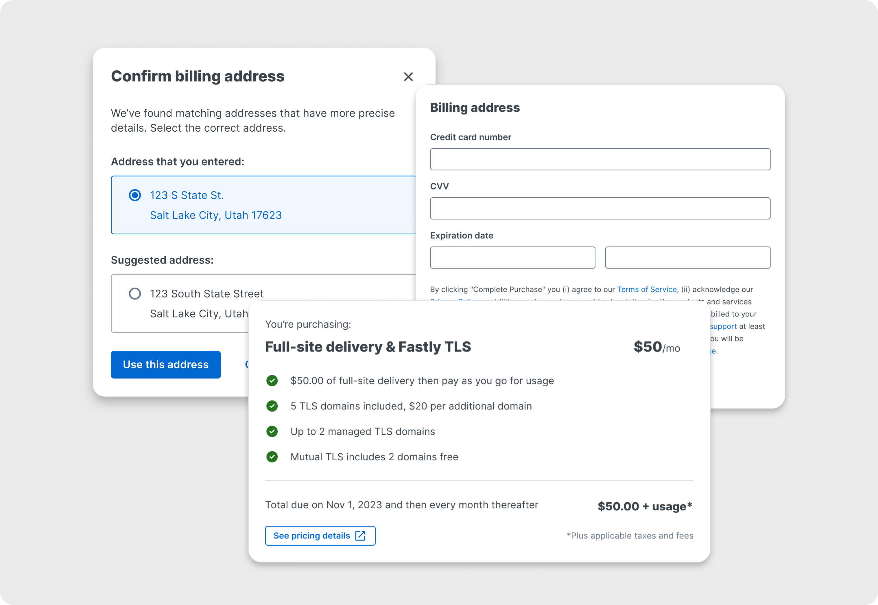
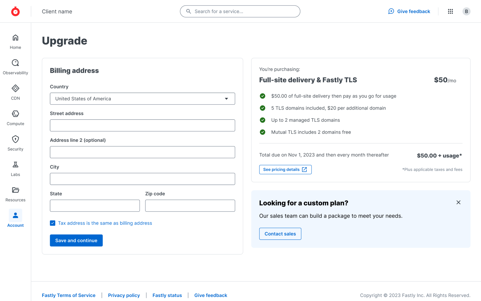 New upgrade page - address step
Verifying Insights Through Usability Testing
To further validate our findings, I set up an unmoderated usability test through UserTesting.com. I tasked participants with completing the old upgrade process using dummy accounts. In addition to testing the flow, I asked participants if they understood the terms of the subscription they were upgrading to.
Usability test findings:
- 57% of participants completed the upgrade process.
- Users took over a minute on average just to locate the upgrade page.
- We witnessed participants falling into the same “stuck” state we had seen in our metrics.
The test confirmed the need for a drastic redesign, particularly around unifying the upgrade steps and clarifying the terms and conditions.
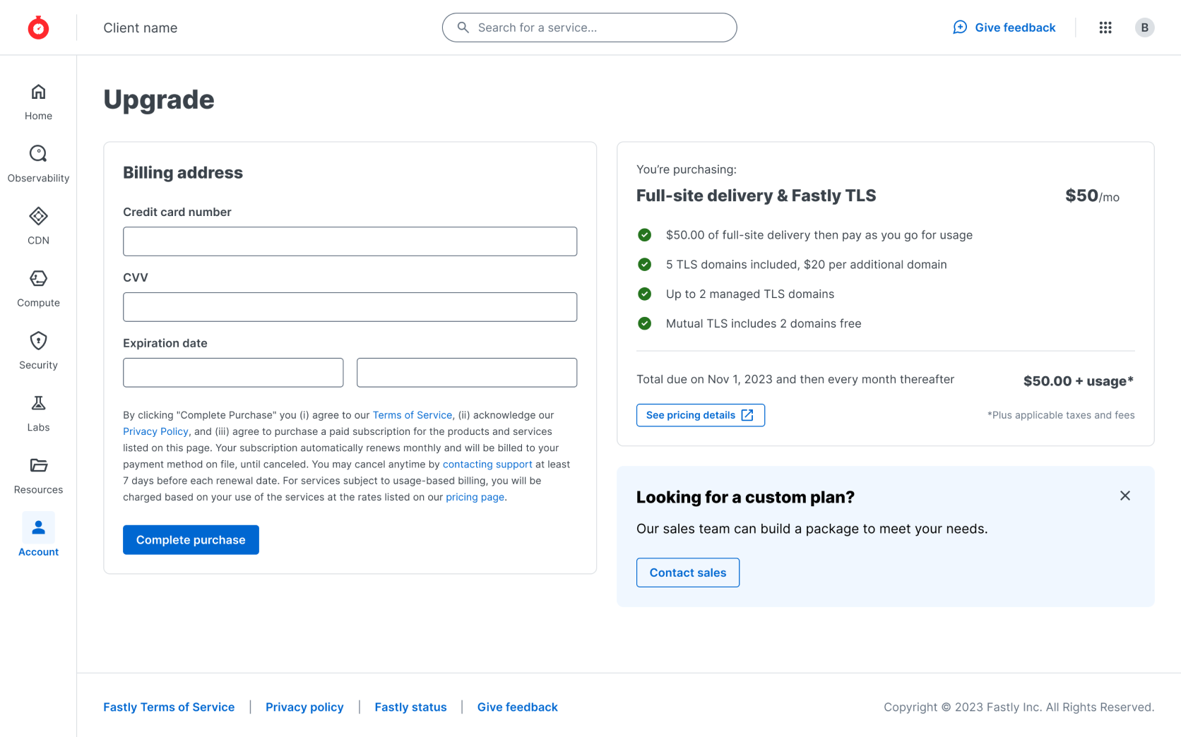 New upgrade page - payment step
Designing the Solution
Armed with both quantitative data and usability insights, I started sketching potential solutions. I conducted a competitive analysis of upgrade experiences, looking at how other companies, including Shopify, designed their checkout flows.
Key Design Decisions:
- Unified Pages: I merged the tax address and payment details forms into a single, streamlined page. This removed the need for users to navigate between two separate sections.
- Shopify-Inspired Layout: I adopted a layout similar to Shopify, placing the payment form on the left and a clear summary of the upgrade terms on the right. This not only made the process more intuitive but also ensured users saw all necessary information in one place.
- Payment Management: I added an improved post-upgrade experience for managing payment details, ensuring we maintained feature parity with the old system.
- Legal Compliance: I worked closely with our legal team to ensure the design met all compliance requirements, particularly around the clear disclosure of terms and conditions.
I quickly prototyped the new flow in Figma and collaborated with developers to address technical constraints from Fastly’s outdated billing system, making adjustments where necessary.
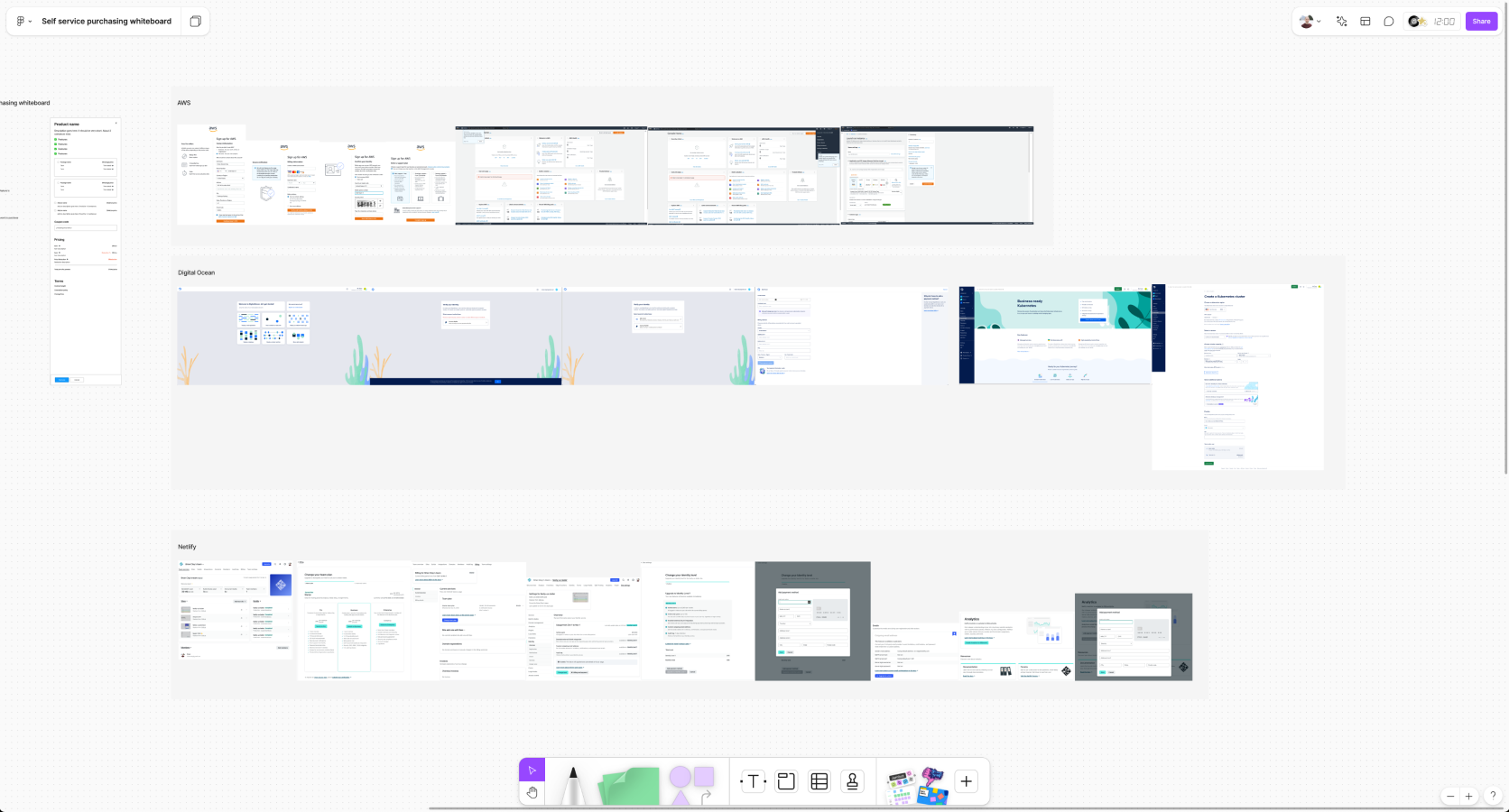 Competitive analysis FigJam Board
Testing the New Design
Once the design was finalized, I ran another round of usability tests using a Figma prototype. This time, participants completed the process with significantly better results:
- 100% of users completed the upgrade flow once they found the page.
- Time on task decreased by 44%.
However, users still had difficulty finding the upgrade page—a problem we decided to tackle separately, as it was outside the immediate scope of the project.
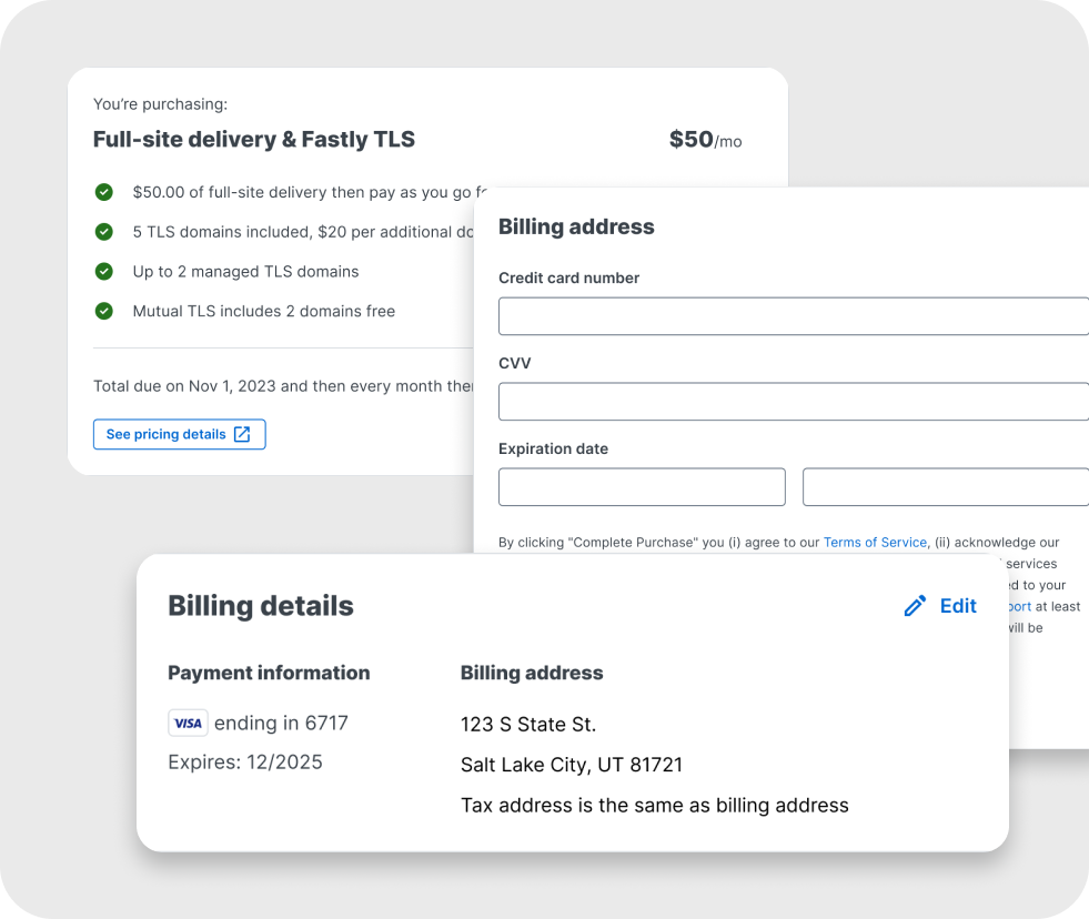
 Key checkout components
Technical Challenges & Adjustments
As we began building the new upgrade experience, several technical constraints emerged that required design adjustments:
- Outdated billing system limitations: The system couldn’t distinguish between a new upgrade and a user editing their payment details. This meant we had to use the same success message for both scenarios. I worked closely with our content team to craft messaging that would be clear and applicable in both contexts, minimizing confusion.
- Address formatting requirement: Our billing system required a very specific format for billing addresses. If a user’s entered address didn’t match the required format, the system would generate a suggested version. To handle this, I designed a modal that presented the suggested address to the user, giving them the option to either accept the system’s suggestion or stick with their original input. This solution ensured smooth processing while maintaining user control.
- Legal compliance: We also had to satisfy legal requirements regarding the display of terms and conditions during the upgrade process. After some iterations, I adjusted the layout and copy based on feedback from the legal team, ensuring the design met all necessary compliance standards.
By addressing these technical and legal challenges, we were able to deliver a seamless upgrade experience that worked within system limitations while keeping the user in control.
 Key checkout components
Results and Key Learnings
The new upgrade experience has been live for six months, and the results speak for themselves:
- 300+ new upgrades per month.
- Conversion rate increased by 22%.
- The “stuck” state was eliminated, ensuring all users who enter payment information now complete the process.
- Mobile-friendly design, enabling users to upgrade seamlessly from any device.
- Satisfied legal requirements, bringing Fastly’s upgrade flow into compliance.
Lessons Learned
- Iterative Testing is Key: Usability testing at both the problem-identification and solution-validation stages was crucial in refining the design.
- Collaboration Across Teams: Working closely with legal, engineering, and writing teams helped us navigate technical and legal constraints while maintaining a user-centered design approach.
- Scope Management: While we identified additional pain points (like finding the upgrade page), focusing on the core upgrade flow allowed us to deliver impactful results within a tight timeline.
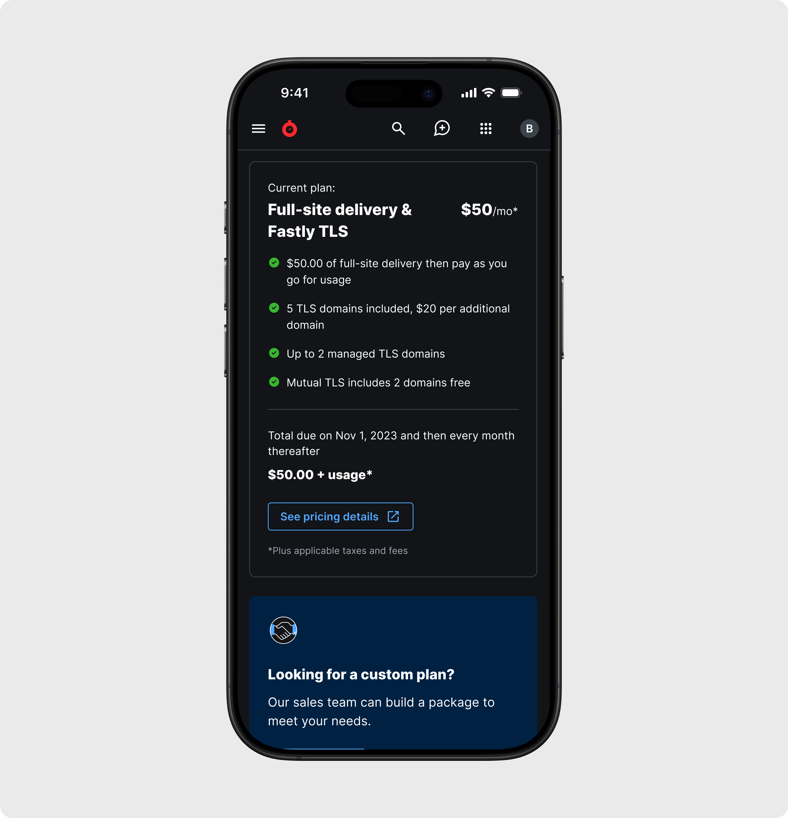 Mobile upgrade page